Jude White
AS Level Media Studies

Mojo House Style
As a magazine, Mojo's house style is surprisingly disjointed. The magazine contains many different sections, each with their own colour schemes, held together only by uses of brand identity. These include re-use of the Mojo logo and the same fonts throughout.
Presentations of the Artist
In this issue of Mojo, Siouxsie Sioux is not presented identically on the DPS to how she is presented on the front page. Keeping to convention, she doesn't appear at all on the contents page. The main reason she does not appear exactly the same on the front page as the DPS is that the DPS contains exclusively historical photographs, given that the article deals with the history of the band. Whilst her make-up and hairstyles remain fairly similar throughout, they are never identical to the front page, and her clothing is different in each image. However, she still frequently wears the same sullen expression on the DPS as the front page. Perhaps the most notable difference is the fact that on the forn page, her hair is mostly red, whereas on the DPS we only see her with small red streaks in her hair, and even then this is only in one picture. For a historical article there is not ikely to be a good deal of consistency in artist appearance, except for their basic style; in Siouxsie's case, this is heavy, pale make-up, gothic or expressive clothing, a wild hairstyle and to an extent dark red lipstick.


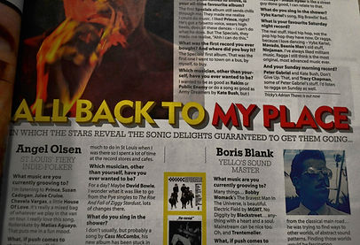
Mojo's masthead itself does not set up a house style as such, because it varies in colour. Indeed, Mojo is an extremely variable magazine, and so it relies more on brand identity to be recognisable. There are several small house styles within any given issue of Mojo, each representing a different section of the magazine, an interesting and unusual approach. Whislt the masthead does not set up a house style, it is used in several locations to further Mojo's brand identity. For example, here (top left) it is priunted very largely above the contact details, and here (top right) a non-bold version of the logo is used next to every page number, to ensure that were a page used from the magazine, for example on the internet, one would know which magazine the page came from without needing to see the front page.
The Masthead

Colour
Individual sections of Mojo are identified by the different house styles that apply to each one. For example, the 'What Goes On' section uses a colour scheme of red, yellow, black and white, whereas the 'Mojo Filter' section differentiates itself by using blue, black and white. In sections involving very prestigious bands, gold is even sometimes used. The individual house styles are achieved through the use of coloured text and graphics. These differences are even shown on the contents page, so that when a reader arrives at a section they can identify it by its colour.


Fonts
The same fonts are consistently used throughout Mojo, even across sections, creating a recognisable house style despite the variations in colour. For example, for almost all the magazine's headings, the masthead font is used, a recognisable and individual font which helps establish both brand identity and house style. Furthermore, the same sans-serif, modern, professional-looking font is used for all of the magazine's large bodies of text. A thin serif font is used for subheadings, as well as the contents page headings. There are not a great deal of fonts used, which makes the entire magazine feel consistent.


