Jude White
AS Level Media Studies

Front Page Construction
To begin, I needed to create a new document measuring 850x1200 pixels in Photoshop, the correct proportions for a magazine front page.
Following this, I created a gradient background to my page, so as not to use a dull white background, which is less aesthetically pleasing. In order to do this I drew a white box using the rectangle tool, and following this clicked 'Layer>Layer Style>Gradient Overlay


Now I had a blank canvas onto which to work.

The first thing I added to this was my masthead. I typed the text using the horizontal type tool, and selected the chosen font, before pressing 'Cmd+T' to use the transform tool. This allowed me to adjust the size of the masthead to one that looked aesthetically pleasing.

Next, I added my edited main photograph. It was important to do this now, as this would dictate the positioning of all the other elements on the front page. I ensured to hold the Shift key whilst transforming the photograph, as this kept the model in proportion, ensuring her features were not distorted. I also added the strapline by typing it below the masthead using the type tool. I transformed this to be the same length as the masthead, so the two sat neatly together. I changed the colour of the strapline to match the model's colour scheme of red.


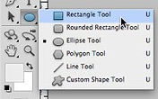
Now came the time to add the banner across the top of my front page. I created a black smart object using the rectangle tool.


I then duplicated this layer and dragged the second banner to the bottom of the page. I now had two black banners, creating symmetry.

The next step was to add cover lines to these two banners. I typed the text out in two portions for the first banner, thinking this would make it easier to use a different colour for the second portion of the text, but I soon realised that this only complicated matters. For the second cover line, I used only one layer. In both cases, I used the transform tool to ensure that the text filled the banner as well as possible, which could not be achieved as easily by typing in the font size I wanted. It was easier to judge this visually.


I used the font 'Base 02' for the text, due to the fact that this font was used in my magazine's strapline, and using it here maintains a degree of continuity. This font does not remove the impact of the masthead, an effect that would have been caused by re-using the masthead font. I also coloured the bulk of the text white, and key areas red. These colour not only stood out from the background, but also matched the clothing and make-up of my model. The red draws the eye of readers to important and exciting parts of the cover lines.

I now began to add the remainder of my cover lines, using the techniques shown above. I used a more gothic font for these, and this was also the font I decided to use for my main heading. The font was called 'Times New Yorker,' a font I acquired from Dafont.com. However, for the brief descriptions of these cover lines, I used a different font, which looked modern and professional due to its sans-serif nature, and was overall easier to read than the gothic font in large quantities. This also helped to split up the titles and the actual content.


For the 'Foo Fighters' and 'Muse' cover lines, I used red. I ensured this was the same shade of red as I had used previously using the eyedropper tool and clicking on the prior red. By typing these in red, I ensured that I drew attention to the biggest and most well-known names on the cover, sparking immediate interest.
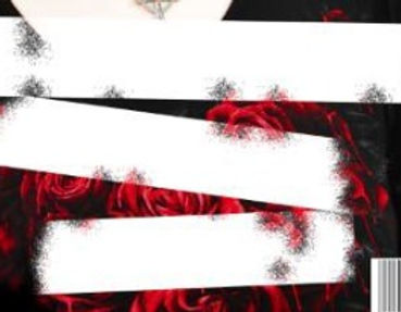
To serve as a backing for the main headline, I created two smart rectangles using the rectangular marquee tool. I coloured these white so they would stand out against the dark colours of the model's clothing.

In order to edit these and create a grunge style, I needed to rasterize these layers. This would allow me to edit them by turning them into an image as opposed to a re-scalable smart object.

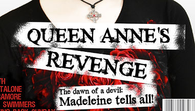
My next task was to create a custom eraser brush, to allow me to erase parts of the rectangles and make them resemble coloured tape that has been worn away with time. To do this I went into the 'Brush' tab (Window>Brush), and modified the settings, such as the scattering, which slightly randomized my eraser's position each time I used it.


I added another object to use as a backing for the subheading, rasterized it, then erased parts of all 3, which made the objects appear old and faded. They also resembled tape, which had vague connotations of rock music, as tape such as this can be used for labels on instruments and equipment.
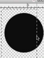
I decided that I wanted to create a small sticker-stlye graphic to advertise a free poster giveaway inside my magazine. I egan by opening a new photoshop document and creating a circle-shaped object using the elliptical marquee tool.

I then used layer>layer style>gradient to add a faint gradient, using the eyedropper tool to begin with the same red used on the rest of the front page. The red gradually faded into a darker shade. I used the angle adjuster to find an angle that looked nice. In the pictures below, I am using an incorrect gradient, which I corrected at the end of the process to make my sticker look more like a part of my cover as a whole.

Next, I added text to this sticker using the same methods as the cover lines. I was sure to choose a bold font, as this would serve as a good cutting outline for later stages. I used Ctrl+Click, selected Warp Text, and clicked on 'Arc.' This allowed me to wrap the text around the edge of the sticker.


Next, I selected the custom shape tool and selected a heart. I created a small grey heart, then used the elliptical marque tool to create one small dot, which I copied three times using Cmd+C. I positioned the three small dots around the heart. I did this because on the flag of the Queen Anne's Revenge pirate ship, this design was used.
However, following this, I decided that rather than using a curved text effect, I would employ a small graphic on the edge of the sticker to give the impression that one edge was folded over. This made the sticker look more three-dimensional. I did this by using the elliptical marquee tool to add another cirlce graphic, and rasterize it before deleting the majority of this to leave a small segment. I deleted the text, and re-typed it in a different font, deciding that it would suit the sticker better.


I used the transform tool to reposition the remainder of the circle, then lightened the layer by presssing Cmd+U and dragging the slider to produce a more pleasing grey; I had forgotten that post-rasterization, I could not edit the shape's colours at all. However, seeing as I wanted a grey colour anyway this was not problematic.
I searched the internet and found a gold metal texture to use for my text. I desaturated this to look silver (Cmd+U, saturation slider), and positioned it beneath my sticker, using the eraser tool to ensure no protruding edges were visible. Selecting my text and the heart/dots logo, I pressed backspace, deleting any material in the selection zone. I did this for the base layer of my sticker as well, allowing the silver texture to show through the gaps and thus creating a foil-blocked effect.


My finished sticker.

I dragged the sticker across from its own document into the front page document, resized it using the transform tool, and rotated it slightly to give the impression it was haphazardly stuck on, furthering the grunge theme of the magazine.
I then noticed, however, that the foil did not have as strong a gradient as the rest of the sticker. I needed to paint a layer above the foil, but below the main sticker, which I did with the brush tool, selecting white to begin with. To this paint, I added a gradient, which made the white fade into black gradually, using the steps demonstrated above. I dropped the transparency on the paint layer, giving the impression of light and dark areas on the foil.


Only two steps remained before completion of my front page. The first was to add a list of additional features. To do this, I used the horizontal type tool to type out a selection of band names, then chose a font and a colour as demonstrated above. However, I needed to ensure that the text was justified to the left, as I wished to position this element in the bottom left corner of the page. To do this, I highlighted the text and clicked on 'left align text' in the top taskbar.


Here I have created a flow diagram logging the various stages of the construction process.


Finally, all I had to do was type and position the text for my masthead, using the same techniques as shown above. I used the same font as the cover lines, Times New Yorker, for consistency, and becuase it looked nice with the destroyed tape background.

My finished first draft.

However, I soon relised I'd forgotten the price, date and issue number...
