Jude White
A2 Media
9315
Film Site Research
In order to gain a grounding in the design of websites for films, I did some research into existing examples in order to identify the kinds of features they include, and apply many of these to our own site.
Godzilla
The first site I decided to look at was the page for the 2014 movie 'Godzilla,' a very interesting and vibrant website with a lot of technical elements, such as a soundtrack playing in the background while on the page, and animations for switching pages. I have mostly decided to look in detail at the features I found the most interesting.

'Downloads/Roar'
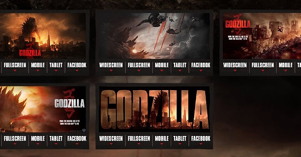
Two pages that particularly caught my attention were titled 'downloads' and 'roar'. These pages allow users to download free Godzilla wallpapers and an mp3 of Godzilla's iconic roar to use as a ringtone. Not only do these free items encourage brand loyalty, but they also serve as free advertising for the film itself, an idea I would very much like to include in my site.

'Soundtrack'
This page refers users to a free streaming service where they can listen to the film's soundtrack. Again, not only does this get people excited for the film, but it also links users to a purchase option for the album as a download.

'Timeline'
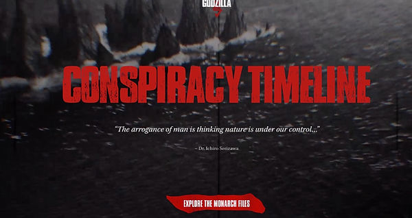
This link opens a new tab, redirecting users to another website providing a timeline of events leading up to the plot of this film, which leaves readers with questions the film can answer, thus making them want to see it on release.
'Gallery'
This page simply shows viewers several high-resolution screenshots from the film. This builds intrigue to see these dramatic moments in context.

The website features every trailer for the movie, as these are a film's main advertising medium, and the film's webpage is a logical place to find these.
'Videos'

The Conjuring
'The Conjuring's website was very different from that of 'Godzilla', not only thematically but even in terms of format. The page for this film is in fact a part of Warner Brothers' larger site, rather than a separate domain. Flashier animations and soundtracking are swapped out for a condensed design, with most key features on one page. The mise-en-scene of the page does not directly relate to the film, unlike 'Godzilla'. At the top of the page is a basic plot synopsis, and interestingly the film's score on reputable review aggregator 'Rotten Tomatoes.'

'Photos'
Similarly to the 'Godzilla; site, this site features a slideshow of screenshots from the movie, to build intrigue.

'Soundtrack'
Unlike the 'Godzilla' site, only a preview of this film's soundtrack is available on the site, but ultimately the purpose is the same; to generate excitement for the film.

'Video'
A feature on both of the sites I have looked at so far is the inclusion of all the film's individual respective trailers.

Pacific Rim
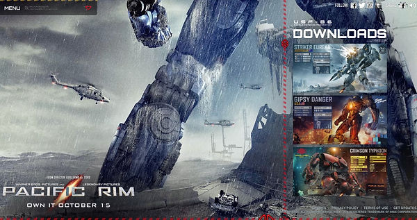
The website for 'Pacific Rim' is largely similar to that of 'Godzilla,' possibly due to the fact the film was released by the same company, Legendary. However, some features on the site differed from the 'Godzilla' site, making it more than worth covering.

'Downloads'
Similarly to the 'Godzilla' webpage, this page allows followers to download free high-res wallpapers.

This novelty section of the site provides a factual-style guid for surviving against the movie's antagonists. In doing so, it provides readers with information about the movie and generates hype.
'Kaiju Survival Guide'

'Pacific Rim Store'
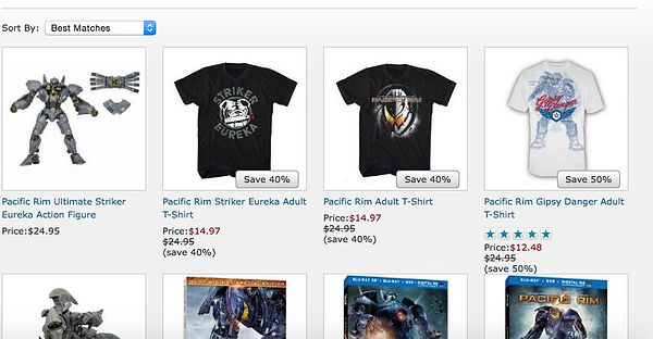
This store allows people to buy merchandise related to the film in question. This is something I could potentially include in our own site.
'Story'
This page gives readers the basic storyline of the movie, as well as the story of its creation, informing readers of some of the people behind the film's construction. People may be excited to see big names, or may just be curious about the story, but in either case this generates excitement for the product.
